 UISandbox
Radix Themes theme editor
React components with a real theming API, but one that takes CHOICES, not values. UISandbox builds Radix Themes 3.3.0 from its own package and opens it in the editor: seven screens in Radix Themes's own components and its own defaults. Turn the brand, the type, the spacing and the corners, and every component follows. Nothing to install, nothing uploaded.
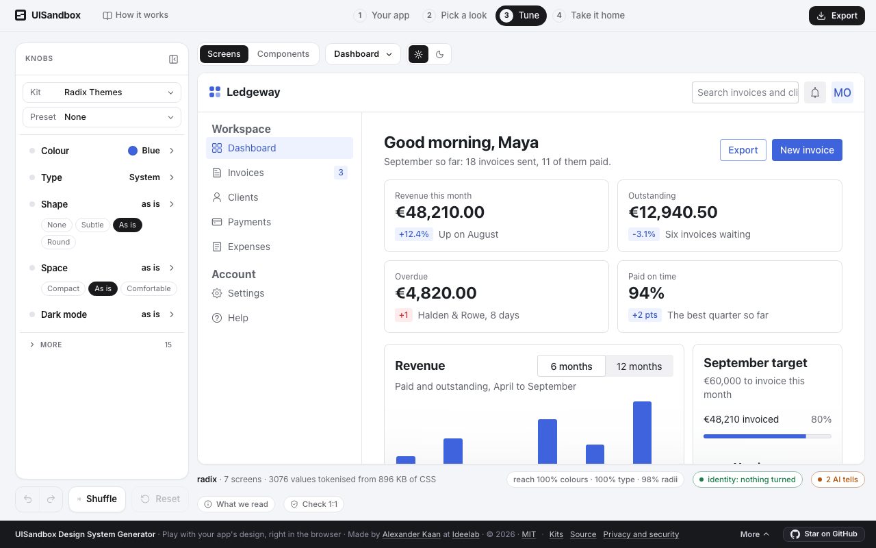
What is read from Radix Themes
- Version
- 3.3.0
- Licence
- MIT
- Package
- @radix-ui/themes
- Runs in
- React
- Variables
- 136 in its light mode, and its own dark mode, read from its package
- Brand as it ships
#3e63dd- Body type
- the system stack
What you take with you
Export writes Radix Themes's design system in Radix Themes's own names, starting from what you see:
theme.css: the variables, in Radix Themes's own names, as the knobs left theminstall.md: where each file goes, step by stepMANIFEST.md: what could not be done, said rather than substitutedDESIGN.md: the design system for people and agents: colours, type, spacing, what each is for.claude/skills/design-system/SKILL.md: for Claude Code, Cursor or Codex: build the next screen in Radix Themes's own classestokens.json: W3C design tokens, which Tokens Studio and Figma variables import
On your own app
If your app runs on Radix Themes, the sandbox recognises it from the rendered page and writes the design system in Radix Themes's names from your app's own values. What you turned on the kit comes with you. The quickest way in is the one where nothing leaves your machine: run npx uisandbox-mcp open in your project, or ask your agent to "open this app in UISandbox". How it works.