 UISandbox
shadcn/ui theme editor
React components copied into your repo: you own the source, it is not a dependency. UISandbox builds shadcn/ui from its own package and opens it in the editor: seven screens in shadcn/ui's own components and its own defaults. Turn the brand, the type, the spacing and the corners, and every component follows. Nothing to install, nothing uploaded.
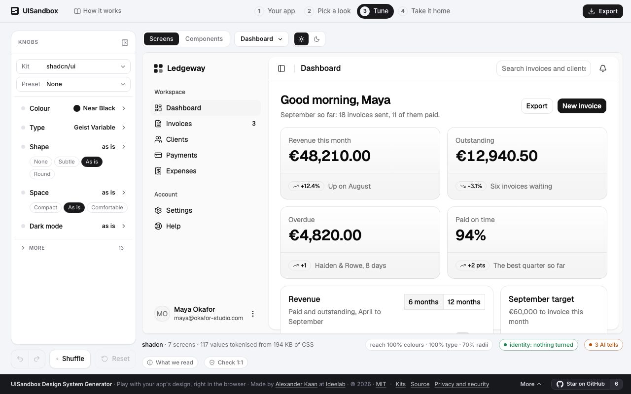
What is read from shadcn/ui
- Version
- follows its registry; no package version
- Licence
- MIT
- Package
- none: its CLI copies the components into your repo
- Runs in
- React
- Variables
- 32 in its light mode, and its own dark mode, read from its package
- Brand as it ships
#171717- Corners
10px
What you take with you
Export writes shadcn/ui's design system in shadcn/ui's own names, starting from what you see:
components.json: shadcn/ui's own config, so its CLI adds components in this themetheme.css: the variables, in shadcn/ui's own names, as the knobs left theminstall.md: where each file goes, step by stepMANIFEST.md: what could not be done, said rather than substitutedDESIGN.md: the design system for people and agents: colours, type, spacing, what each is for.claude/skills/design-system/SKILL.md: for Claude Code, Cursor or Codex: build the next screen in shadcn/ui's own classestokens.json: W3C design tokens, which Tokens Studio and Figma variables import
On your own app
If your app runs on shadcn/ui, the sandbox recognises it from the rendered page and writes the design system in shadcn/ui's names from your app's own values. What you turned on the kit comes with you. The quickest way in is the one where nothing leaves your machine: run npx uisandbox-mcp open in your project, or ask your agent to "open this app in UISandbox". How it works.